- Home
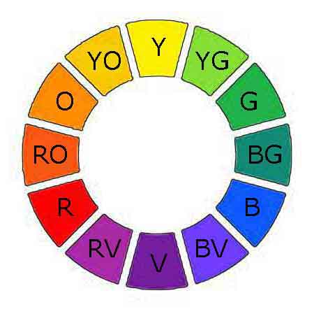
- Color Wheel
- Meaning of Color
How artists use the meaning of color in artwork
Artists often use the meaning of color to convey deeper messages in their paintings.
Color is fascinating with its emotions, sentiments, and symbolism.
Do you wonder how a color will evoke certain emotions or why some colors stand out more? Are you intrigued by the idea that colors can enhance or suppress different aspects of your paintings?
Knowing the sentiments of each color and how to effectively use them can elevate our artwork.
 Wise artists choose their colors carefully.
The meaning of color symbolism
Many colors have symbolic meanings that create a mood or emotion that connects with the viewers non-verbally.
Color symbolism can add layers of meaning to our artwork. Blue for example, can symbolize tranquility or melancholy. Red on the other hand may relate love or anger.
We may choose to paint traditional themes, our culture or personal experiences with color symbolism. Color is the most valuable tool of the painting artist.
On this page we will explore:
- The mood and emotional meaning of colors
- The seven individual colors of the rainbow
- Painting and learning color
the meaning of color shapes our world
Color directly impacts how we interpret the world.
Consider
how a sunset paints the sky in an array of hues. Each color change subtly
shifts our perception of the time of day.
 Our world is shaped by color.
Warm colors, such as red, orange, or yellow create a sense of warmth, excitement, or even aggression.
Orange found in vibrant sunsets and autumn landscapes speaks of transition.
Red depending on its context, can symbolize everything from divine love to the devil's temptation.
Violet was once used for royal and sacred themes. In today's art, it
often conveys feelings of magic, mystery, or nostalgia.
Cool colors like blue, green, or violet tend to provide a calming, soothing effect.
Blue skies introduce calm and tranquility. The presence of green in an artwork can shape a soothing, relaxed ambiance.
Strategic use of color allows the artist to shape a compelling painting.
the meaning of
Color related to emotions
Have you ever wondered why some colors make you feel calm,
while others sow seeds of excitement? This is because colors affect
human behavior and emotions.
For instance, lighter hues like sky blue or soft pink create peace and tranquility. Vibrant colors like bright red and orange excite the viewer with energy.
By understanding and using these concepts, artists can effectively engage their audiences on an emotional level.
How does color affect the mood of a painting?
Colors set the mood and play a role in how our artwork is experienced by the viewers.
 The mystery of dark colors
Artists can use color to create paintings that exude joy, tranquility, tension, or despair.
A painting filled with bright, vibrant colors can suggest happiness and vitality. A festive event may use golden yellows and fiery reds to capture the energy and excitement.
On the other hand, dark, muted colors might evoke a mysterious mood. A scene of solitude could be painted with cool blues and soft grays.
It also matters how the colors are put together.
The colors may be combined in a harmonious manner. Or they may be used to jar the emotions of the viewers.
How the artist uses color is how we entertain the viewers and tell stories with our art.
Fine art paintings rely heavily on color. What is fine art?
the specific meaning of Colors
Color is amazing, it empowers us to engage the viewers in a meaningful dialogue without uttering a single word.
Let's look at the seven rainbow colors in nature, what they mean and how they may be used in our paintings.
red commands attention
Red is used by artists in nearly every culture.
 Red is a color of passions.
Symbolically red is the color of passion. It symbolizes love, intensity, courage, power, anger, danger, blood or the devil depending on the context.
Emotionally, red stimulates a faster heartbeat and more adrenaline, thus making it a high-impact color that can evoke strong feelings.
In paintings: Red, visually is a fiery color, powerful in drawing attention and making the other colors stand out when it's used as an accent.
Artists can use red to create an area of emphasis or capture high-energy in their paintings. It creates an undeniable visual draw.
The sight of red in our artwork brings an immediate sense of life. Its bold nature serves to dramatize and intensify the elements of our paintings where it is applied.
orange is energetic
Orange is between the expressive red and cheerful yellow.
 Orange is enthusiastic.
Orange symbolizes warmth and enthusiasm. It is often
linked with creativity, success and change.
It’s an emotionally invigorating color that encourages social interaction.
In our artwork: Visually, orange is a hot color, noted for its visibility and attention-grabbing quality. Artists can use orange to draw the viewer's attention to key areas of the painting.
Combining orange with cooler colors, especially blue will create a dynamic visual impact.
Orange also the perfect hue for capturing the vibrancy of sunsets, autumn, or any scene with a warm, energetic feel.
yellow, the sunshine color
Yellow is a stimulating color that arouses feelings of cheerfulness and mental activity.
 Yellow is full of joy!
Yellow is often associated with joy, optimism, and energy.
Bright yellow hues transmit pleasure and lightness. Golden tints offer an air of antiquity and comfort.
Yellow can have some negative effects. It may be seen as a warning, like in our caution traffic lights and cowards are called yellow.
Using it in our artwork: Yellow is the lightest color of the spectrum. It draws attention and can be used to create highlights in a piece of art.
It works well with
darker shades making a sharp contrast. It brings a sense of liveliness
to our art paintings. I love painting daisies no matter what color they are. Learn how to paint daisies.
the meaning of the color green
Green is the most restful color for the human eye.
 Green portrays growth and life.
Green symbolizes growth, life, stability and renewal. It certainly has a strong tie to money.
Sometimes people may be called green with envy. It can also represent jealousy or inexperience.
In our paintings: Using green is a great way to introduce harmony and a natural atmosphere into our artwork.
In landscape paintings, it creates a sense of vastness and natural beauty.
Light greens are calming and rejuvenating, while dark greens communicate wealth, stability, and luxury.
We can create contrast and set a peaceful mood by using varying shades of green.
blue skies
Blue is an extremely
useful color for artists. It's capable of creating a variety of moods, atmospheres,
and depths.
 How does a blue sky make us feel?
Blue can represent peace, tranquility, loyalty, wisdom and confidence.
Mid to dark tones of blue stimulate trust and loyalty. It has calming, soothing effects resulting in mental relaxation.
Depending on the saturation and tone, blue may also portray melancholy.
In our artwork. Blue is the main color seen in the sky and oceans.
Visually, blue hues recede and create a sense of distance and space. Therefore, artists often use blues in
landscapes and seascapes to create atmospheric perspective.
Applying different shades of blue, from the palest blue to deepest blue, can create a sense of calm, space, or coolness in our paintings.
indigo power
Indigo is a blend of blue and purple that makes it look like a dark, subdued blue.
 Indigo makes us think. Eating anyone?
Indigo invokes intuition, wisdom and contemplation.
Due to its deep value, indigo is associated with knowledge, power, integrity, and seriousness.
It transmits feelings of introspection, and wisdom. It's a compelling choice for artwork aiming to invoke deep sense of thoughtfulness.
Using indigo in our paintings: Indigo is a cooler and darker hue that can add depth and sophistication to our paintings.
Artists can utilize indigo to create points of interest or depth within their works. Its strength as a color can give a fresh, distinctive touch to our artwork.
purple ignites the imagination
Purple, also called violet combines the energy of red with the calm of blue.
 Purple is a sophisticated color.
Purple depending on the shades, can evoke feelings of luxury, wealth and royalty. It may also be used to portray courage.
Beyond that, violet is also associated with creativity, imagination, mystery, and magic.
It’s a calming and a spiritually uplifting color that can inspire introspection and sentiments in the viewer. Visually violet adds depth, richness, and contrast to a painting.
Using violet: As an artist, using violet in our work can add a richer and more luxurious feel to the painting. It can generate an air of imagination, leading viewers to a deeper understanding and appreciation of our artwork.
Violet is a beautiful counterbalance to yellows, oranges, and other warm tones. It is also a useful color to mix into shadows.
Painting with color
Artists convey their messages, manipulate the viewer's emotions, guide their gaze, and enhance the viewer's overall experience with our use of colors.
Each color carries a weight of meanings and interpretations. Even the absence of color can speak volumes.
Whether it's a self-portrait, a landscape, or abstract art, how we use color can significantly impact the story and emotional impact of our paintings.
How do warm vs. cool colors impact a painting?
The contrast of warm and cool colors is a strong tool for composing compositions.
 Cool colors recede.
Warm reds, oranges, and yellows are visually stimulating and seem to come forward in the composition. They make the objects appear closer than they actually are.
Cool colors on the hand - blues, greens, and purples seem to recede in the composition. They create a sense of depth and space.
The interplay between advancing and receding colors creates an illusion of three-dimensions on our two-dimensional painting surface.
Warm and cool colors can also influence the painting's emotional tone.
An abundance of warm colors can make a painting feel intense or exhilarating. In contrast, a cool painting may feel peaceful.
learn the meaning of color
Color has the ability to trigger responses.
Try this: When you paint a color ask yourself, "What emotion does this color evoke?"
Answering this question consistently will drill the emotional meaning of color into our artwork. Selecting colors that express emotions will become second nature.
color is awesome!
Artists use the meaning of colors to create many moods and effects.
 Let your paintings move out with color!
- Bold, saturated colors can draw the audience's attention and stir excitement.
- Pale or muted hues can imply softness, nostalgia or even indifference.
- Color can create the perception of three dimensions on a two-dimensional surface.
- Impressionists paint two colors side by side to trick the eye into seeing a third color.
- Blue can be used to create aerial perspective.
- Abstract art allows artists to use the impact of colors, away from traditional restraints.
- Artists glaze watercolor to create depth and luminosity.
Colors are a powerful tool we use to mold emotions and tell stories in our artwork.
Use the meaning of color to experiment and play like never before.
Enjoy using the power of color!
there's more about color
Artist Color Wheel: The Artist's Favorite Tool
The artist color wheel is the artist's favorite tool for creating beautiful art. The understanding of color gives us a great advantage in our painting skills.
Color bias: the key to realistic colors
What is color bias and what does it really mean to you, as an artist? Learn how to mix realistic, natural colors and solve the problem of muddy colors.
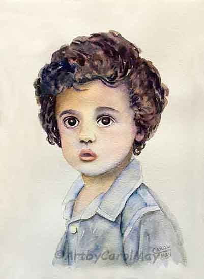
Mix Skin Color for Your Portrait Paintings
You can paint portraits when you know how to mix skin color. Make the skin colors and paint a child’s portrait with a step-by-step watercolor painting guide.
Painting with a Limited Palette: Mastering Color Harmony & Creativity
Discover the art of painting with a limited palette. Tune in to color harmony & craft a fun, colorful, harmonious step-by-step painting with only four colors.


Recent Articles
-
How to Start an Artwork Painting
 Use five easy steps to start a painting. You can start any painting with these steps. Use the steps to start painting the tutorials and you can use them to paint your own individual creations. But, ho…
 -
Rule of Thirds Creates Easy Compositions
 Create dynamic compositions with the rule of thirds. It's the artists' shortcut for an easy composition. The idea started back in the 1700a and artists and photographers have been using it ever since…
 -
Color bias: the key to realistic colors
 Have you ever struggled with getting the perfect color mixture? Is it possible the culprit could be color bias? Find the answers as we look at questions about color bias. What exactly is color bias an…
Recent Articles
-
How to Start an Artwork Painting
Use five easy steps to start a painting. You can start any painting with these steps. Use the steps to start painting the tutorials and you can use them to paint your own individual creations. But, ho… -
Rule of Thirds Creates Easy Compositions
Create dynamic compositions with the rule of thirds. It's the artists' shortcut for an easy composition. The idea started back in the 1700a and artists and photographers have been using it ever since… -
Color bias: the key to realistic colors
Have you ever struggled with getting the perfect color mixture? Is it possible the culprit could be color bias? Find the answers as we look at questions about color bias. What exactly is color bias an…