- Home
- Mixing Colors
- Color Bias
Color Bias: The Key to Realistic Colors
Artists use color bias to mix and match perfect colors.
We can mix accurate colors for landscapes, skin tones or any element in our artwork.
Realistic, lifelike colors are mixed using color temperatures. If we prefer bold, vivid colors, we can mix those too.
We anticipate how our colors will mix together, so our paint mixtures will be clean and appealing with no more unintended, muddy colors.
 Color is freedom!
 Color is freedom!
Color brings life to our paintings. If you’ve ever struggled with getting the perfect hue this page has answers.
We will look at frequently asked questions about how to mix colors.
- What is color bias in painting?
- How does color bias affect color mixing?
- How do we mix colors to get a realistic effect?
- How can we identify color bias in different paints?
- What are common mistakes with colors?
What is Color Bias in Painting?
Color bias might sound like a technical term, but actually it's very simple.
Paint colors are friendly. They like to visit their neighbors. One color may lean toward a warm neighbor. Another color may visit to a cool neighbor.
This gives colors a warm or a cool bias. Do all colors have color bias?
Yes, this works the same for every color no matter, where they are on the color wheel. Primary, secondary and tertiary colors all have a warm or cool undertone.
For example, red is normally a warm hue. But the red, Alizarin Crimson leans toward violet giving it a cool undertone. Another red may have a warm bias because it leans toward its orange neighbor, like Cadmium Red.
Color bias important in painting, especially for mixing colors. It's the artist's key to beautiful colors.
If you want the broader foundation behind these ideas, start with how to mix colors and then use color bias to refine your mixtures.
How Does Color Bias Affect Color Mixing?
We can mix our colors more accurately when we know their bias.
Are warm and cool colors related to color bias? Yes, warm and cool colors are just less technical terms for warm and cool color biases.
 We can mix good colors.
A color's temperature bias (warm or cool) has an effect on how it mixes with other colors.
What happens when we mix colors with similar biases?
The resulting mixture tends to be clear and vibrant.
For example, mixing Cadmium Yellow (which leans towards orange) with Cadmium Red (also leaning towards orange) results in a bright, clear orange.
What happens when we mix colors with opposing biases?
The result is muted and sometimes muddy colors.
If we mix Cadmium Red (warm biased) with Alizarin Crimson (cool biased) we will get a muted red instead of a vibrant hue.
To understand why colors lean warm or cool in the first place, review the color wheel to see how neighboring colors influence each another.
How Do We Avoid Mixing Muddy Colors?
Knowing that certain color combinations can make dull colors, helps us to mix bright, clean colors when want them.
What's the key to mixing clean, vibrant colors?
- Mix warm-biased colors with other warm-bias colors.
- Mix cool-biased colors with colors that have a cool bias.
How Do We Mix Colors to Get a Realistic Effect?
Color bias is definitely related to mixing realistic colors.
Knowing the biases allows us to anticipate how colors will mix together, leading to more realistic skin tones, landscapes, and other elements in our paintings.
 Natural colors are restful.
We know that every color has either a warm or cool bias. For example, a red may lean towards orange (a warm bias) or violet (a cool bias).
We can use this knowledge to mix vivid colors.
To mix a vivid green we could mix a green-bias yellow (like Lemon Yellow) with a green-bias blue (like Phthalo Blue GS).
Notice the yellow and blue have both the same bias - green, a cool bias.
Mixing paints with opposing biases (cool vs warm) results in more realistic colors.
For example, a cool yellow (Lemon Yellow) mixed with a warm blue (like Ultramarine), cool vs warm will result in muted, realistic greens.
We also use contrasting biases during the actual painting process.
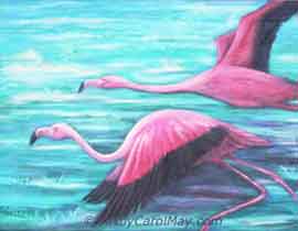
The palm tree foliage (in the painting) is warm-biased greens painted with a cool-biased greens. Contrasting temperatures portray realistic scenes.
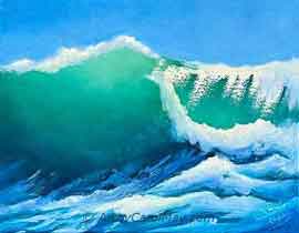
The cool-blue sky mix is offset by the warm yellow-biased colors in the clouds.
The subtle undertones of colors allow us to create more lifelike scenes. It can change our paintings from good to great.
This is particularly important in portrait painting, where realistic skin tones require a delicate balance of warm and cool biases to mix the color accurately.
We may use a mixture of warm and cool colors. Yellow ochre (a warm yellow) could be mixed with Cerulean (a cool Blue) and a touch of Alizarin Crimson (cool red) to mimic the complex undertones of human skin realistically.
Knowing this allows us to select and use our palette more effectively.
Color May Affect the Mood
Color bias can also affect the mood of a painting.
Imagine a warm-biased glow of a morning sky or the cooler color of an overcast day. The different undertones allow the viewers to experience the mood of the scene.
Artists can use the meaning of colors to create the emotional tone of their artwork.
To capture a late afternoon sky, we would use warm-biased colors for the sunlit portions contrasting with cooler blues for the darker portions of the sky.
Recognizing and working with color bias helps us achieve life-like, realistic colors.
How Do We Identify Color Bias in Different Paints?
Developing an eye for color bias begins with observation and practice.
Many times, it's hard to see a bias right out of the tube
because the paint is concentrated.
 Does the color have a warm or cool bias?
Spread a little of the color on a light surface from dark to light.
Try a yellow for instance, when you spread it out, do you think it has a warm orange cast or a cool greenish tinge?
When we can't see the bias, do some mixing.
Mix the yellow with a warm blue like Ultramarine. Then do another mixture with a cool blue like Phthalo Blue, green shade.
Which mixture is clean and which looks dirty.
The clean mixture reveals the bias of the yellow.
- A clean color from mixing with the warm blue, says it's a warm, red-bias yellow.
- Good color from the cool blue mixture, means the yellow has a cool, green-bias.
A Color Chart Is Valuable
We
can go all out and create a color chart. Use a large sheet of white paper for the chart.
Mix each color with a warm counterpart. Also, mix each color with a cool color.
For example, we can mix all our blues with cool Lemon Yellow. Vibrant greens from these mixtures tells us which blues have a cool, green bias.
Then mix all our blues with a warm yellow, like Indian Yellow. Clean greens from this mixture mean the blues have a warm, violet-bias.
Put samples of the mixtures on the paper and label them. Then we can refer our color chart while selecting colors for a painting,
#1 What's an Easy Way to Determine Color Bias?
#1 What's an Easy Way to Determine Color Bias?
Paint manufacturers put color charts on their websites.
We could look at the famous English paint company, Winsor and Newton or the wonderful American paint manufacturer, Daniel Smith.
They put all their colors into a chart starting with the cool yellows. The yellows get warmer as they approach the oranges. The oranges start out cool and get warmer toward the reds, etc.
We have an idea of a color's bias by where it appears on the chart. Ask ourself, "Is the color closer to warm colors or cool colors?"
We may not be able to tell by looking if it's in the middle of a range of hues, like in the middle of the reds.
Sometimes the description tells if it's warm or cool. If nothing is in the description, we can determine its bias by doing some mixes, as described above.
#2 What's the Color Bias of Popular Warm Paint Colors?
#2 What's the Color Bias of Popular Warm Paint Colors?
Here are some warm, single-pigment paints, with their biases.
Cool Yellow: Lemon Yellow, Transparent Yellow
Warm Yellow: Cadmium Yellow Deep, Yellow Ochre
***
Warm Orange: Cadmium Orange, Pyrrole Orange
Cool Orange: Quinacridone Burnt Orange, Burnt Sienna
***
Warm Red: Vermilion, Scarlet Lake
Cool Red: Alizarin Crimson, Quinacridone Red
#3 Can You Tell Me the Bias of a Few Cool Colors?
#3 Can You Tell Me the Bias of a Few Cool Colors?
Here are the cool hues from the artist's color wheel with their temperature biases.
Warm Violet: Dioxazine Purple, Quinacridone Violet
Cool Violet: Ultramarine Violet, Cobalt Violet
***
Warm Blue: Ultramarine Blue, Cobalt Blue
Cool Blue: Phthalo Blue green shade, Cerulean Blue
***
Warm Green: Sap Green, Phthalo Green yellow shade
Cool Green: Viridian, Phthalo Green blue Shade
What Are Common Mistakes with Colors?
Even experienced artists can run into issues with color bias, leading to unwanted colors. We can avoid these mistakes and keep our paintings fresh and vibrant.
- The most common mistake we make is neglecting to consider the bias
during the mixing process. It can result in unintended or muddy colors. We prevent this problem by noting the biases before we mix.
 Vivid colors are energetic!
- Artists might use the same temperature bias in the entire painting. The paintings might seem flat or unrealistic, lacking the dynamics of alternating warm and cool tones.
- Another mistake is not using warm and cool colors to create depth perception. Warm colors come forward and cool colors emulate distance.
- Don't forget the nuances of light in a painting. Warm and cool undertones portray light and shadow or the different times of day.
- Also, contrasting warm and cool colors can suggest the turn of a cheek in a portrait or the form of an apple in a still life.
Ultimately, understanding color bias gives artists a greater level of control over our work, allowing us to predict and refine the colors with precision.
More Keys to Good Colors
- Select good quality paint. Paint labeled 'Artist Paint' contains more color pigments. They are brighter, clearer colors.
- Choose single-pigment colors. They mix well with other colors and typically contain fewer impurities. Look on the paint label to see if there is only one ingredient.
- A limited palette of a few colors can help our color mixing. For example, a palette of Ultramarine Blue, Burnt Sienna, Yellow Ochre, Permanent Alizarin Crimson, plus Titanium White can yield a broad range of natural looking colors. Many of the famous Old Masters used a limited palette for their stunning works.
- Look for paints with few additives or impurities.
Sap Green is a nice green out of the tube, but try mixing it. Yuck! It makes awful looking mixtures. The reason is the paint contains a lot of impurities.
Viridian, Chrome Green, and Winsor Greens (Phthalo Greens) are clean greens that are good for mixing.
Black paint has the most impurities of any color! That's one reason black dulls another color when we mix it in. All the impurities start making mud.
The best idea is to mix our dark colors from the colors in our selected color scheme.
Winding It Up
You're now better equipped to manage your palette with confidence and creativity.
Understanding color bias helps us to predict the outcome of our paint mixtures and refine the colors with precision.
- All colors have either a warm or cool bias.
- Mixing paints with the same bias creates clean, vivid colors.
- Mixes of opposing temperature biases make muted, realistic colors.
- Determine the biases by mixing exercises or check the 3 questions listed above.
- Clean, high-quality, single pigment paints make the best mixed colors.
Whether you are a budding or seasoned artist, using color bias knowledge in your artwork can boost your paintings from good to great.
Explore the website for more resources to inspire and refine your artwork.
Enjoy More Color!
Color Schemes in Art Create Vivacious, Harmonious Paintings
Discover how color schemes in art can transform your paintings by creating harmony, mood, and emotion. Explore popular schemes to enhance your artistic vision.
Choose Colors for a Painting: Select Harmonious Colors
How do we choose colors for a painting? You can create beautiful, harmonious paintings. How do professionals create beautiful paintings with only 3 or 4 colors?
How-to Mix Skin Color for Your Portrait Paintings
You can paint portraits when you know how to mix skin color. Make the skin colors and paint a child’s portrait with a step-by-step watercolor painting guide.
How to Mix Colors: Essential Tips for The Artist
Everything we need to know about how to mix colors for our paintings: colors for mixing, create color harmony, mix dark neutral colors, how to use in paintings.


Recent Articles
-
Fix Common Mistakes
May 01, 26 01:00 PM
 Every artist encounters common painting mistakes. There are times when a painting just does not seem to work. Most often it's a design issue. The problems come back to composition, focal point, and va…
 -
Find Your Art Style
Apr 24, 26 01:00 PM
 Finding your style isn’t about picking a label or copying someone else. It’s about noticing what you’re drawn to - and repeating a few things long enough that your choices become consistent. Go from l…
 -
Create Your Own Art!
Apr 14, 26 01:16 PM
 If you have been following the step-by-step lessons and you are ready for the next step. Begin creating your own paintings with confidence. Learn how to plan a painting, solve common painting problems…