- Home
- Values in Painting
How Do We Use Values in Painting?
Color is fun, but using values in painting is fundamental for successful artwork.
Values are the backbone of strong, attractive paintings!
Using my own paintings for examples, let's explore how to see values, the best place for contrasting values, how to adjust values and planning them for your art.
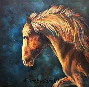 Values create strong paintings.
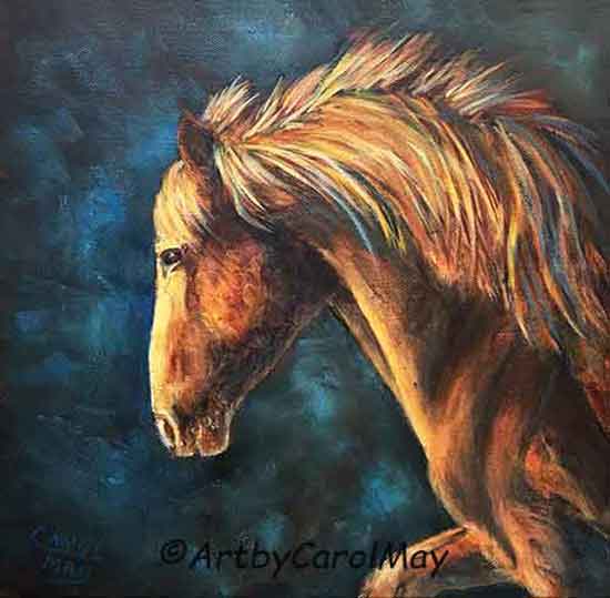 Values create strong paintings.
What Are Values In Painting?
Values are the light and darkness of colors.
How Do We See Values?
Artists train themselves to see values.
We learn to see the light and dark in our subjects by squinting our eyes and then look. The details disappear and we see the light and dark tones.
 Squint your eyes and look.
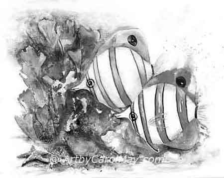 Did you see this?
Lower your eyelids and look at the things around your room. Notice the
light and darkness of different things in the room. Train your eyes to
see the light and dark values of things around you.
Look when you are going down the road - as a passenger of course. Things will suddenly become more alive as you observe the values.
Duplicate the values you see into your paintings. It makes painting exciting!
Ladies you may not want squint lines, so instead of squinting just lower your eyelids.
Or you can see values by looking through red cellophane.
In the 1980s, I started using red cellophane from the dime store secured in a cardboard frame made from a cereal box.
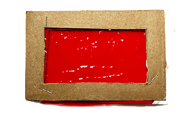 My homemade value viewer
Today, I still use it to check the values while I'm painting. It's very handy to use instead of squinting. There's more about artist Carol May.
Try This Quick Value Study
Quick Start - Value study: (10 minutes)
- Choose a simple object lit by a lamp or window (to create shadows).
- On a small scrap of paper, block in only 3 values: light, middle, dark.
- Don’t draw details, just big shapes of light and shadow.
Step back and look: does the object feel 3D and clear, even without color?
Even small improvements in values can improve our paintings.
The Best Place to Use Values in a Painting
The focal area is the place to use our lightest lights and darkest values.
A strong contrast of lights and darks will automatically draw our eyes to the focal point.
As much as I love color, a painting must have good contrast and a variety of values to be successful.
Look at the barn painting below:
- The back barn is the focal point of the painting.
- Its bright wall is the lightest value.
- The dark door creates good contrast.
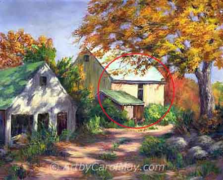 The focal area uses high contrast.
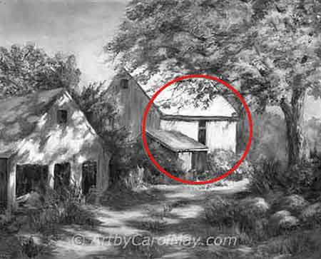 See the contrast in the grayscale.
The contrast of the values, saturated colors, soft and hard edges plus detail are all tools we use in painting a focal point.
Artists use any or all of these items to create the focal point in paintings.
Why Are Colors Different Values?
Different colors absorb and reflect different amounts of light.
The more light a color reflects - the lighter its value. Colors that absorb a lot of light are dark values.
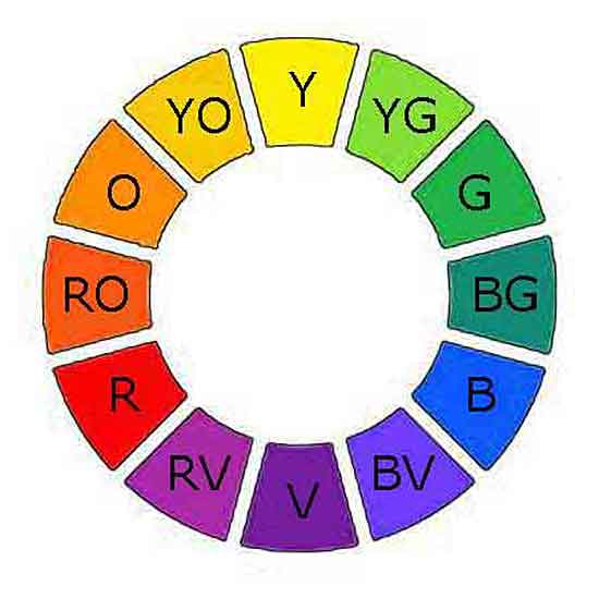 Artist color wheel
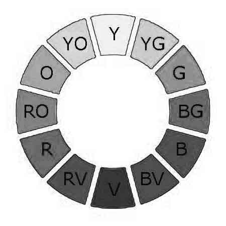 Gray-scale of a color wheel
Yellow reflects light more than any other color. Lots of light bounces back off yellow. That makes yellow look light because of all the light that shines into our eyes.
Purple or violet is the darkest color. It absorbs most of the light rays that shine on it. Very little light bounces back to us. So, purple looks very dark.
The value scale in art has nine steps of gray between white and black.
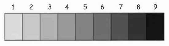 Yellow is #1 and Purple is #9 on the value scale.
All the other colors fall in-between 1 and 9 on the nine-point value scale.
Why Does My Painting Look Flat?
We all want successful paintings. But a painting with all the same values will look very flat.
Without a distinct difference between light and dark values, we could not see any forms or shapes - no matter how many colors we use in the painting.
 This painting uses lots of color.
 The values make it work.
Planning Values for a Painting
A good painting starts with a plan.
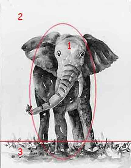 Vary the size and value of each area.
Repetition is boring, so make each part of the painting a different size and a different value.
- The elephant is the
largest and basically the darkest element.
- The background is medium sized and a light, contrasting value.
- The foreground is the smallest area with a mixture of medium values.
We don't have to use all nine values in every painting, but concentrate on getting at least three different values into the painting.
Make sure there is a definite contrast in the values. That's what makes an attractive painting.
How Do We Adjust Values for Painting?
We may of course use different colors to get different values.
But we can adjust the value of colors. There are three ways to adjust the value of a color.
These three techniques adjusted the values in the painting below.
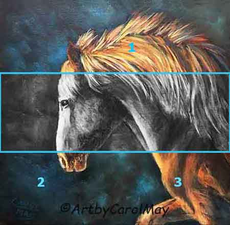 Three ways to adjust the values.
- Add white to create tints to raise the value. The colors in the mane were tinted with white to lighten their values.
- Add black to create shades that lower the value.
The value of the background was shaded with a black to lower the value.
- Mix a color with its compliment to subdue the color and lower its value. Orange was subdued with its blue complement to create the shadows.
The gray-scale in the image shows the effect of the three value adjustments.
Do Artists Have to Follow the Rules?
Artists have the freedom of color. There is no rule that says a person has to paint something its actual, natural color. Color is a wonderful gift from God that makes painting lots of fun!
A painting works
as long as we use values.
Dolphins in nature are actually gray. Plain old gray is boring to me, as an artist. So, I painted these dolphins pink and purple instead of gray.
The values made the painting work, regardless of what colors were used.
 Artists don't have to paint natural colors.
 The values make the painting work.
Use Values in Your Next Painting!
Painting is Fun!
Painting with a Limited Palette: Master Color Harmony
Discover the art of painting with a limited palette. Tune in to color harmony & craft a fun, colorful, harmonious step-by-step painting with only four colors.
Focal Point in Paintings: How to Attract the Viewers
You can create a focal point in art. A complete guide of proven techniques using contrast, color and composition for attractive paintings to engage the viewers.
Principles of Art: Use Them with the Elements of Art
Create successful paintings using the elements and principles of art. Pleasing compositions are made using any combination of the 7 elements and 10 principles.
How to Paint Good Art: Fundamentals Create Awesome Art
Painting good art begins with the fundamentals; composition, focal point, color and values. See them in my painting with a checklist for assessing your art.


Recent Articles


-
The Big Three
Sep 18, 26 12:00 PM
 You can create good art using the big three painting fundamentals. Learn how to paint good art with good composition including a focal point, values and color choices. Use these three important fundam…
 -
Design Paintings
Sep 04, 26 12:00 PM
 There are basic types of compositions in art paintings, symmetrical and asymmetrical. Most other compositions are variations of these two basic types. See paintings of the common types; S-curve, pyram…
 -
Good Compositon
Aug 27, 26 01:25 PM
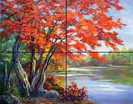 A good composition draws the viewers to our paintings. How do we make a good composition? When we are designing a painting a good rule is place the main subject (the focal point) left or right of the…