- Home
- Mixing Colors
How to Mix Colors: Everything You Need to Know
An understanding of how to mix colors brings joy and excitement to the art of painting.
Who doesn't love color? Artists have the power in our hands to make the perfect color mixtures for our artwork.
We can create a range of colors that are often unavailable in store-bought paints.
 Color makes our paintings sing!
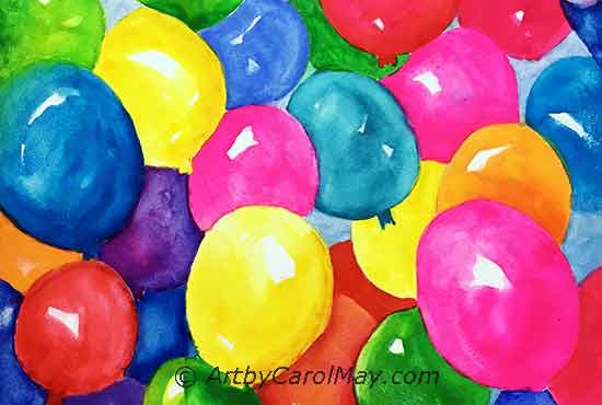 Color makes our paintings sing!
The Joy of Mixing Colors
We will explore the primary, secondary and tertiary colors, their complements, with pro-tips on mixing color and how to use color in our paintings.
Color Terminology for Mixing Colors
Color terms are a key in learning how to mix colors. Mastering these terms will lead to more refined and satisfying color mixing.
We know color names
such as red and green, etc.
 Shades, tints and tones
What color terms should we know?
Hue is the name of a color family. For example, apple red or fire engine red are both red hues.
Shades are created by mixing any hue with black. A shade is darker and duller than the original color.
Tones are made by mixing a color with grey.
Tints occur when white is added to any color.
Saturation/Chroma is the color's purity or intensity.
Value is the light or darkness of a
color.
How to Mix Colors
Practice mixing the secondary and tertiary colors. You'll be surprised how easy it is.
What Materials Do We Need for Mixing Colors?
Get a few things together and start mixing your own unique colors.
Color Wheel: A color wheel is indispensable when we are learning how to mix colors. It shows the relationship between different colors and it's useful in predicting the result of our mixing.
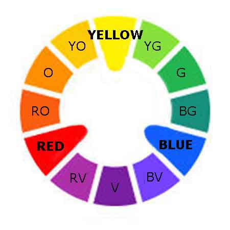 Mix colors with the primaries.
Colors: We will use a limited palette of 3 colors.
The three primary colors; yellow, red and blue are equally spaced around the color wheel.
Primaries are the original colors and they cannot be mixed from any other colors.
Manufactures don't make the exact primary colors. However, the following three colors are widely available and they are fine to practice mixing.
- Cadmium Yellow
- Cadmium Red
- Ultramarine Blue
We can use these three colors to mix most any color imaginable.
Palette: A place to layout the colors that has enough space for mixing.
Palette Knife or Brush: Oil and acrylic artists may use a brush or a palette knife.
Watercolor artists would of course mix with a brush and water.
Painting Surface: Canvas paper or watercolor paper are just fine to see the results of mixing.
Mix the Secondary Colors
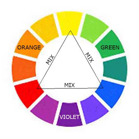 How to mix the secondary colors
Looking at the color wheel, each secondary color is half way between two primary colors.
Create each secondary color by mixing together a small patch of their two primary colors:
- Mix red and yellow to create orange.
- Mix blue and yellow to create green.
- Mix red and blue to create violet.
Orange, green and violet are so easy to mix!
We can get more colors by varying the amounts of each primary color.
Now we don't have to buy these colors because we can just mix them.
How to Mix More Green Colors?
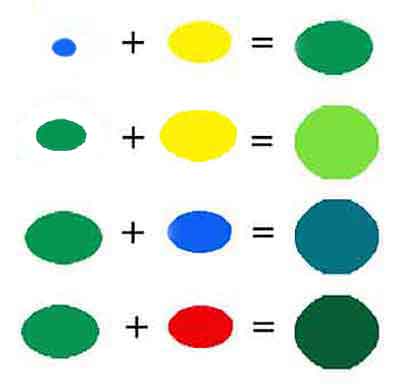 Mixing green colors
Thalo Blue is a very strong blue that is not on our practice list. However, it makes the most beautiful greens.
Use just a touch of Thalo Blue with yellow to mix a green. Go down to tip #2.
Now we can mix more greens:
- Starting with the mixed green, add more yellow to get a nice spring green.
- Add blue to your green for a cool blue-green.
- The addition of red to the original green will produce a darker, more subdued green.
It's easy to mix a wide variety of greens with other blues, yellows, reds and orange.
Nature provides a wide variety of greens. Ultramarine Blue and yellow make quieter natural looking greens.
If your green looks too garish, add a touch of Burnt Sienna (an orange) to quiet it down.
Tertiary Colors: Expand Your Mixing Possibilities
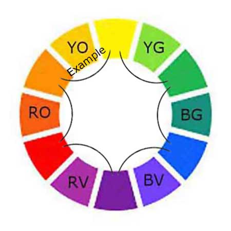 How to mix the tertiary colors.
Tertiary colors are created by mixing a primary color with a secondary color.
We have the secondary colors we just mixed on our palette. Now, mix our orange with primary yellow to create yellow-orange, as in the YO example.
Mix the other tertiaries around the color wheel:
-
YG - yellow-green
- BG - blue-green
- BV - blue-violet
- RV - red-violet
- RO - red-orange
Now we know how to mix the tertiary colors, so we don't have to buy them. It's so easy!
7 Tips for Mixing Art Colors
Click on the questions to see the answers.
#1 How Do We Mix Vibrant Colors Without Them Becoming Dull?
#1 How Do We Mix Vibrant Colors Without Them Becoming Dull?
When we start with good paint, the resulting mixtures are more likely to retain their brightness and intensity. Look for high quality, single pigment paints.
Artist quality paints have
strong
pigmentation
that creates vivid mixtures. Single pigment paints usually have fewer additives that can muddy up colors.
In mixing vibrant colors, understand that complementary colors result in a muted color. So, it’s important to use complements sparingly if we want to maintain vibrancy.
Transparent and semi-transparent paint helps retain vibrancy when we are layering colors.
Color bias also has an effect on color vibrancy vs muddy colors.
#2 How Do We Start Mixing?
#2 How Do We Start Mixing?
Always start with the lighter color. Then add the darker color to the light color. It only takes a tiny bit of a dark to change a light color.
What if we're learning how to mix colors of similar values? Just use little dabs of each color until we get the desired mix. When we get the desired color, mix more if needed.
#3 What Colors
Do We Use to Shade and Tone the Other Colors?
#3 What Colors Do We Use to Shade and Tone the Other Colors?
When starting a painting, mix a large pile of a neutral color from the colors of the selected painting color scheme.
Then add white to the neutral mixture to make a variety of greys.
While painting use the neutral mixture or the greys to subdue any of the other colors as desired. This maintains color harmony because all the colors in the painting are related.
#4
How Do We Lighten Colors or Make a Pastel Color?
#4 How Do We Lighten Colors or Make a Pastel Color?
Let's answer both questions.
What's the best way to lighten a color?
White is a cool, opaque color that often creates chalky looking color mixtures.
Rather than using white to lighten a color, add the lighter color beside it on the color wheel. The mixed color will remain bright without a chalky appearance. For example, to lighten orange we add yellow.
How do we mix pastel color?
Pastels are soft, light, and often muted colors. They are created by mixing colors with white.
It's easier to make pastels from a light, bright colors. This time we'll start by mixing white into the selected color.
For example, start with cadmium red and slowly mix in titanium white to get a pastel pink. Add the white gradually and mix thoroughly to get a consistent color.
If we want a soft, muted pastel color, add a touch of its complement. We would add a little pastel green to tone down our pastel pink.
#5 How Can We Make Our Mixed Colors More Interesting?
#5 How Can We Make Our Mixed Colors More Interesting?
Don't mix the colors thoroughly before putting them on a painting. The color variations add interest to our paintings.
Over-mixing can make the colors lose their original vibrancy, resulting in dull colors.
#6 How Do We Use Less Paint for Mixing?
#6 How Do We Use Less Paint for Mixing?
Mix the colors with a palette knife instead of a brush. It uses less paint.
#7 How Do We Prevent the Mixed Colors From Becoming Muddy?
Muddy colors are most often the result of mixing complementary colors. We may not be doing it on purpose, but it can happen.
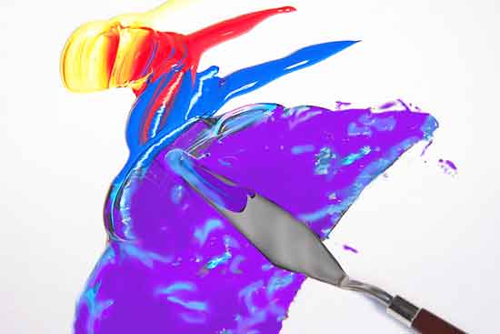 Palette knives are good for mixing.
Mix colors on a clean palette and keep the unmixed color supply clean.
Clean the brush or palette knife before mixing a new color. Any paint left in the brush could alter the new color we're mixing.
Some artists keep several brushes going at once.
For example, one brush for light colors, another for dark colors, or one for warm colors and a separate brush for cool colors. It reduces the chance of getting muddy colors.
Lastly, transparent and semi-transparent colors tend to mix cleaner colors. Opaque colors often mix duller colors. This is not always true, but it's something to keep in mind.
Bonus Question: What Colors Did the Master Artists Use for Mixing?
The master artists like Monet, Leonardo da Vinci and Rembrandt often used a limited palette of yellow, red, blue and green. They mixed all the additional colors for their great artworks.
We can paint any subject with a limited palette. We can mix the skin colors for a portrait painting with only red, yellow and blue.
Many experienced artists use a double primary palette that has a warm and cool version of each
primary color.
How Do Artists Create Color Harmony?
Harmony is an essential art principle that brings balance and appeal to our artwork.
We create harmony in our paintings by using a color scheme that has a limited number of colors.
The colors work together seamlessly, rather than clashing or competing with each other.
The popular painting color schemes use only two to four colors.
An exception is the analogous scheme that may use up to five colors.
A multitude of additional colors can be mixed from the selected scheme. The mixed colors are all remain in perfect harmony.
Using color schemes means we don't have to keep so many different colors in stock.
How Do We Mix Dark, Neutral Colors?
We mix the neutral colors from the colors we are already using in the painting. This maintains the color harmony of the painting.
We can mix black, brown or grey by combining the three primary colors. There are two different ways to do that.
- Mix equal parts of the three primary colors.
- Mix one part of a primary color with two parts of its complement. The complement of any primary is always a secondary color which contains the other two primaries.
Simple, Quick Dark Mixtures
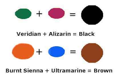 Mix our dark colors
Viridian Green and Alizarin Crimson mixed together create a nice black.
Adding additional Viridian or Alizarin will slant the black toward green or red.
Burnt Sienna and Ultramarine Blue are one of my favorite go-to mixtures.
Adding more Ultramarine makes a cool black.
Use more Burnt Sienna for a nice variety of warm browns.
How to Mix Grey Colors
Mixing white with any of our dark, neutral colors will create various tints of grey. It's so easy when we know how to mix colors, then we don’t have to buy tubes of grey paint.
How to Mix Colors That Look More Natural
A guide to using warm, cool and natural colors in our paintings.
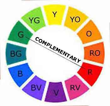 Complements quiet each other.
Sometimes we want calmer, natural looking colors in our paintings.
Mixing any color with its complement will subdue it and make it look more natural.
Complementary colors are directly across from each other on the color wheel.
There are two ways to subdue a color and make it a more natural looking color.
- Mix a color with its complementary color.
-
Mix the color with a black, brown or grey that we have mixed from the colors used in the painting.
Bright, bold colors are lots of fun, but natural looking colors are beautiful, too.
What Are Warm Colors?
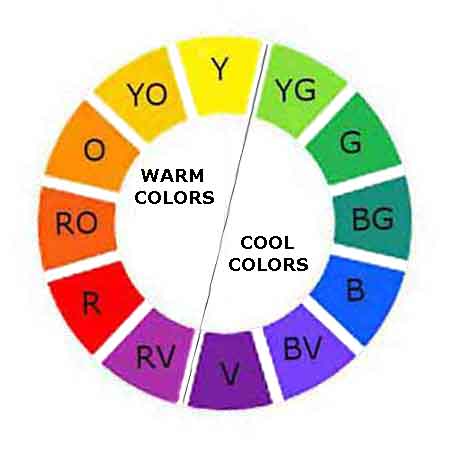 Warm and Cool Colors
Warm colors contain yellow and convey energy. They are known to "advance" toward us, so they make areas of the painting look closer.
Use warm colors in the foreground and middle area of a painting.
How do we mix warm paint colors?
We can make any color warmer by adding yellow or orange which contains yellow.
For example, if we are painting an orange, the center of the orange is bulging toward us. Paint the center warmer to make it advance toward the viewer.
The sides of the orange would be painted cooler to make them turn away from us.
Cool Colors
Cool blue colors can feel tranquil or unhappy. They recede into the painting and look farther away.
We mix cool colors by combining a color with blue or green or purple which contain blue.
- We can create distance in landscape paintings by mixing some blue into the background areas.
- Make the edge of an object turn away from us by adding cool colors to the edge.
- We may also, use cool colors to set one object behind another.
The Joy of Mixing Colors
The art of how to mix colors is an essential skill for artists. By understanding the relationship between colors, you'll be able to predict the outcomes of your mixes and create a harmonious color palette.
Using the knowledge of hues, shades, tones and tints, you'll be able to adjust the colors for your desired effects.
Feel free to explore additional pages on the website to uncover more resources about painting art.
Get your paints out and explore the joy of mixing colors. The world is your canvas, brimming with possibilities.


 Are you eager to learn how to oil paint? What are the essential supplies for oil painting? What do we need for clean-up and how long do oil paintings take to dry? Learn the rules of oil painting and t…
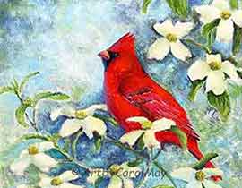 How do we create a focal point in art? Where do we put the focal point? How do we find the focus of an artwork? Should all paintings have a center of interest or can they have more than one? Learn fro…
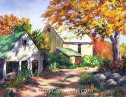 Art elements and principles appear over and over in good paintings. The elements and principles work together for us to create successful artwork. Art principles are the rules that govern how an artis…