- Home
- Color Wheel
Using the Artist Color Wheel: Essential Color Theory for Every Artist
The artist color wheel is an essential tool for both budding and seasoned artists.
It sparks creativity and it's our guide for choosing colors. It's a roadmap to how colors behave in our paintings.
Imagine if we lived like in a black and white movie, that would be terrible! Color brings joy and expression into our artwork.
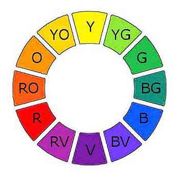 12 Beautiful Colors
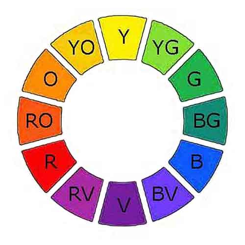 12 Beautiful Colors
On this page, you’ll see how the primaries, secondaries, and tertiary colors connect, and how warm/cool families, complements, and values guide stronger color choices.
These color ideas work best when they support the bigger painting fundamentals of composition, focal point, and values.
Then you can follow the Artist's Complete Color Guide for more about mixing, color schemes, and the meaning of color so your paintings become more intentional and expressive over time.
What Is the Artist Color Wheel?
The color wheel is our tool for creative painting.
It provides the foundation of color theory knowledge to confidently start using and experimenting with color.
First - What is color?
Color is the artist's wonderful tool for self-expression.
When light shines on an object some of the light rays are absorbed by the object. Other rays bounce back off.
The light rays bouncing off an object are its color. For example, a green object bounces green light rays and absorbs the other colors.
Where did we get the color wheel?
The renowned physicist Isaac Newton gave us the color wheel in the
1600s.
He noticed when light goes through a prism, it divides into the 7 rainbow colors; red, orange, yellow, green, blue, indigo and purple (or violet).
The modern artist color wheel excludes indigo and uses versions of the other six rainbow colors.
The Primary Colors
The artist color wheel contains twelve colors. It is based on the primary colors, red, yellow and blue.
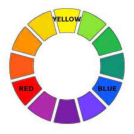 Primary Colors
The artist's fundamental principle of color theory: All other colors on the wheel are variations of the three primary colors.
The primary colors (red, yellow and blue) cannot be mixed from any other colors.
The paint colors closest to the primaries are:
- Cadmium Yellow Light
- Permanent Rose
- Phthalo Blue
Phthalo Blue is a strong, staining color; consequently, many artists use Ultramarine Blue instead.
The Secondary Colors
Secondary colors are a combination of two primaries. For example, yellow and red make orange.
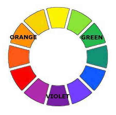 Secondary Colors
The combination of yellow and blue make green.
Blue and red make purple, it may also be called violet.
The secondary colors can have variation. It depends on exactly which yellow, red or blue were used to make the secondary color.
For example: We can get different greens by using various blue colors.
Phthalo Blue and yellow make bright greens. Ultramarine Blue and yellow create more subdued greens.
What Are Tertiary Colors?
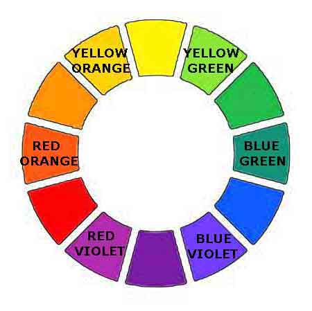
Intermediate colors are called tertiaries.
 Tertiary Colors
We get them by combining a primary color and a secondary color next to it on the color wheel.
For example, combining primary yellow with the secondary color green results in a yellow-green.
Different amounts of yellow or green will give us many variations of the yellow-green.
If we go to the other side of yellow and combine it with the secondary color orange, we get yellow-orange.
The tertiary colors are; yellow-green, yellow-orange, red-orange, red-violet, blue-violet and blue-green.
What Can We Learn from the Color Wheel?
Artists use their knowledge of the color wheel to plan and paint their creations.
What Are Warm and Cool Colors?
Artists often talk about color temperature, warm and cool colors. What are they?
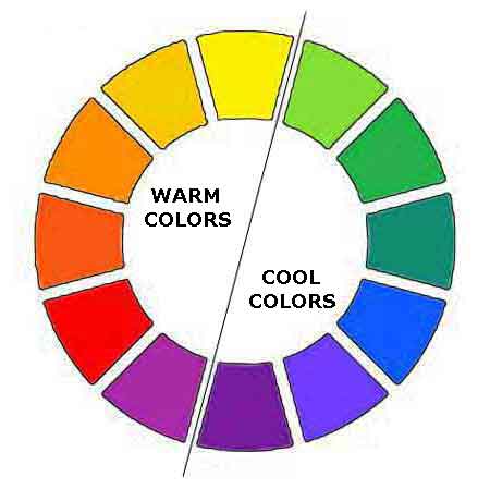
The color wheel is divided into warm and cool colors.
- Red, orange and yellow are considered warm colors.
- Blue, green and violet are usually considered cool colors. (Basically, any color containing blue is considered cool.)
When warm colors are used in a painting, they appear to advance forward in the painting.
When cool colors are used in a painting, they seem to recede into the distance.
Understanding how warm and cool colors make clean or muddy colors.
Wise Artists Use the Meaning of Colors
Different colors can convey emotions, symbolize different things, influence the perception and impact of the art piece.
- Warm colors like yellow and orange generally are happy energetic colors.
- Cool colors feel calm and peaceful.
- Some colors can have multiple meanings and emotions.
Red for instance is considered romantic, but it may also display anger or rage. Green may portray nature or money, but sometimes people can be green with envy.
Explore more about color symbolism and how to use it in your artwork.
Complementary Colors
The colors directly across from each other on the color wheel are complements of each other. Orange and blue, red and green, yellow and violet are all complements of each other.
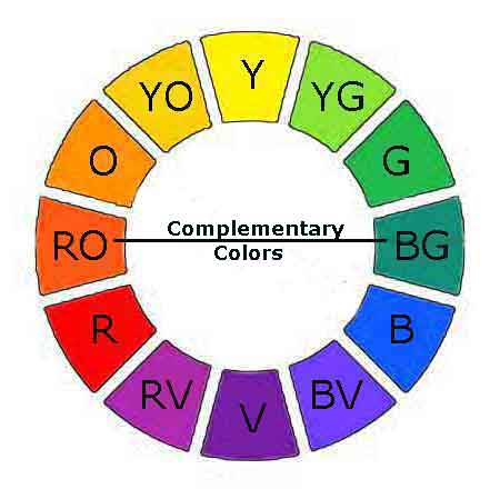 Complementary colors are opposite each other.
What are the traits of complements?
Complements are contrasting values: If one complement is lighter, such as the orange, the color across from on it will always be darker, such as the blue.
They are opposing temperatures: If one color is warm and the opposite will be cool.
Complements neutralize each other: We can cool or warm a color by mixing it with its compliment. We may also neutralize the intensity of the color with its complement.
Complementary colors are used for mixing black, brown and grey colors. Step-by-step color mixing techniques and formulas.
Colors Have Value
Every color is a different value, meaning it's lighter or darker than other colors.
We may turn an image into grayscale like the one below. This reveals:
- Yellow has the lightest color value.
- Violet is the darkest. (Black is not actually a color; it's the absence of light.)
 Yellow and violet are the lightest and darkest values.
When we are painting, we can see the values by squinting or lowering our eyelids. This blocks out light, so we are able to judge the values.
Values are so important for the successful paintings. Contrasting values make exciting paintings.
How to Use Color in Our Paintings
Let's look at how to use complements and warm and cool colors in our paintings.
Use Color to Create Forms
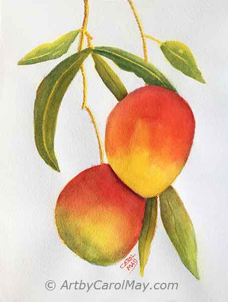 Color temperature creates forms.
- Warm colors advance: Paint the part of an object that is closer to the viewer with
warmer colors.
- Cool colors recede: Paint the parts of an object turning away from the viewer with cooler colors.
Cooler and darker colors on the edge of the mangoes show them turning away from our view.
If the edge has bright light shining on it, we won't paint it darker. But we would still paint it cooler to show it turning away.
But you may say, yellow, orange and red are all warm colors. You are correct.
Yellow is the warmest color but, the less yellow in a color, the cooler it gets. Orange contains less yellow, so it's cooler than yellow.
Red is a warm color, but cooler than orange and much cooler than yellow.
Color is an important part of our compositions in art.
How Do We Create Distance in Our Paintings?
How can we paint the
illusion of distance and depth on our two-dimensional painting surface?
First, we need to understand aerial perspective. Colors get lighter and cooler, when they are viewed from the distance. This is because particles of dust and moisture in the air block the view of things, so they look lighter. This phenomenon is called aerial or atmospheric perspective.
Yellow, our warmest color starts disappearing in the distance and cool blue takes over.
 Colors are lighter and cooler in the distance.
The landscape painting above used three things to create the illusion of distance, aerial perspective.
- Distant colors are lighter and less saturated: The distant mountain colors are painted lighter.
- Cool, (bluer) colors recede: Adding blue moved the mountains into the distance.
- Warm colors advance: The saturated, warm colors bring the foreground forward.
Putting It All Together
Let's look at an example of using multiple color techniques in a painting.
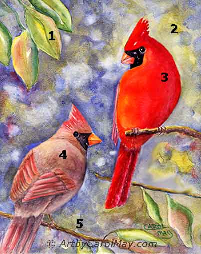
- Warm vs. Cool: The warm colored leaves pull forward from the cool blue background.
- Complementary Colors: The red bird stands out against the complementary greens in the background leaves.
- Creating Forms: The right side of the bird gets darker and bluer to make his body turn away. The left side of its body is warmed with yellow to make it come forward.
- Neutralizing Colors: The female bird colors were dulled by mixing them with their complementary colors.
The top of her body comes forward from her neck because it is lighter and warmer than the neck. - Background vs. Foreground: Once again the bluish background moves back. The warm branch colors move it forward.
Use color in your paintings through the principles of art.
Essential Color Palette for Artists
We refer to the color wheel to decide which colors to keep on hand.
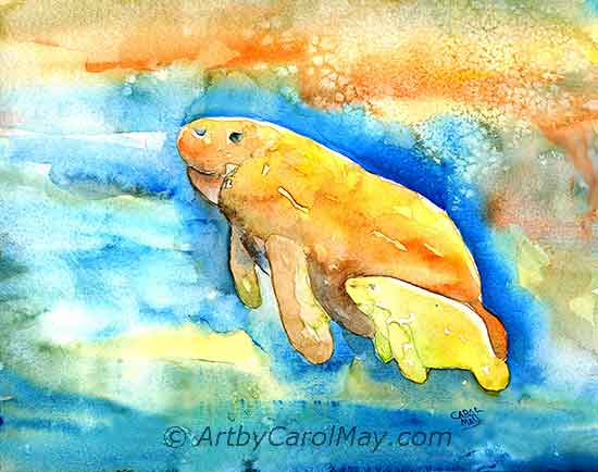 A few colors can make great paintings.
A limited palette of the primary colors is a good choice for any artist, especially beginners. We can never go wrong with:
- Cadmium Yellow Light
- Cadmium Red Medium or Permanent Rose
- Ultramarine Blue, plus white
An expanded palette (a warm and cool version of yellow, orange, red, violet, blue, and green) makes mixing colors quicker.
See the recommended 12 color palette - to ensure you're working with quality pigments that mix pleasing colors.
Frequently Asked Questions
Understanding color theory is important, but having a color wheel tool makes painting easier.
What Do We Look for In a Quality Artist Color Wheel?
What Do We Look for In a Quality Artist Color Wheel?
- Clear primary, secondary, and tertiary color divisions
- Tint and shade examples on the reverse side
- Color mixing guide or formulas
- Durable construction - laminated or heavy card-stock
- Gray scale value finder, optional
What Is an Artist Color Wheel Used For?
What Is an Artist Color Wheel Used For?
An artist color wheel is used for understanding color relationships, mixing colors accurately, creating color harmonies, and selecting color schemes for paintings.
It shows the relationships between the primary colors, secondary colors, and tertiary colors.
Do I Need a Physical Color Wheel or Can I Use a Digital One?
Do I Need a Physical Color Wheel or Can I Use a Digital One?
There is an advantage to both. Physical color wheels are portable they don't need power. Digital color wheels have interactive features, and they work with digital art software.
Many artists use both: a physical wheel for reference and planning, and digital tools for actual color selection.
How Is an Artist Color Wheel Different from Other Color Wheels?
How Is an Artist Color Wheel Different from Other Color Wheels?
The artist color wheel uses Red, Yellow & Blue, RYB. It's great for mixing physical paint colors and understanding color theory.
Digital color wheels often use Red, Green & Blue, RGB. Commercial printing companies use Cyan, Magenta, Yellow & Black, CMYK.
Artist's Complete Color Guide
The color wheel is a super tool for understanding color. Expand your skills and knowledge by visiting additional color pages.
Color Mixing
How to Mix Paint
Colors - Step-by-step techniques for mixing any color.
Mix and Paint Skin Colors - The art of mixing realistic skin
tones.
Understanding Color Bias - The key to mixing clean, clear colors.
Best Paint for Artists - Choose quality paints to mix good colors.
Color Strategy & Design
Color Schemes in
Art - Explore triadic, analogous, and
split-complement schemes.
Choose Colors for a
Painting - Strategic color selection for your individual artwork.
Meaning of Color - Use color psychology and symbolism for expressive artwork.